Twenty-five menu boards from one stylesheet
A taqueria and a coffee shop want different menu boards. So does the same taqueria, on the screen over the bar versus the one at the counter. The usual answer is templates, and templates are a trap.
Once a product ships "designs," every new one is a new file. They drift. A fix applied to one doesn't reach the other nine. Eventually nobody dares touch the old ones, and the design system becomes a museum.
The way out is to notice that "what a menu board looks like" is really two independent questions that got tangled together.
Layout is not colour
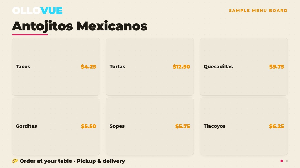
Layout is how the dishes are arranged: photo tiles, a typographic list with dotted leaders, one hero photo beside a rail of names, three dense columns.
Colour is the ground it sits on: near-black, bright, a chalkboard slate, warm paper stock.
These have nothing to do with each other. A chalkboard is not a layout. A three-column grid is not a colour. But most template systems fuse them — "Chalkboard Menu" is one template, "Dark Grid" is another — and the moment you do that, you need one file per combination, and adding a fifth ground means building four new templates.
The rule that keeps it honest
The whole thing holds together on one constraint, written at the top of the stylesheet:
Layouts never declare a colour. Grounds never declare a layout.
Every colour in the board comes from a small set of tokens — background, text, dimmed text, the accent that prices use, the mark that rules and dots use, the card fill, the hairline. A layout may say "this row is a flexible dotted leader" but may never say "this row is grey." A ground redefines the tokens and nothing else.
Break that rule once and you're back to templates, because now one combination needs a special case, and special cases are how twenty-five becomes twenty-four working and one broken.
What it costs to add one
A new ground — say a deep green slate for a place that wants a cantina feel — is seven or eight token values. No markup, no JavaScript, no new endpoint. It appears on every layout at once, and on every venue.
A new layout is a block of CSS and one number: how many dishes fit before the rows stop being legible across a room. Cards hold six. The typographic list holds eight. Single-column holds twelve.
That number matters more than it sounds. It's the difference between a board that looks designed and one that looks crammed, and it's the only thing a layout genuinely needs to tell the rest of the system.
One thing a system like this can't fix
We built the whole grid, rendered every combination, and then looked at them — which is the step people skip.
The dish names were being cut off. "La Única Mexican Street Corn Ribs" was rendering as "La Única Mexican St…". Not in some exotic new combination — in the default one, the one already on the wall in a real restaurant.
A guest cannot order a dish whose name is cut off. No amount of architectural elegance rescues that; it's just a bug, and it was found by rendering the actual output and reading it, not by reasoning about the CSS.
- Names now wrap to two lines in every multi-column layout
- The clamp at two lines is what keeps row heights bounded — without it a long name would push the board off the screen
- The full-width single-column list is deliberately excluded, because there names have always fitted
The system made the fix cheap: one rule, applied once, correct in every layout and every ground immediately. That's the real return on separating the axes — not the twenty-five combinations, but that the twenty-sixth improvement lands everywhere at once.
← All notes